eLearning course design and development
| Project Type | Professional (UBC CPD) |
|---|---|
| My Role | Instructional Design, Visual Direction, UX Design, Web Development |
| Collaboration | Learning & Curriculum Manager, Subject Matter Experts (SMEs) |
| Timeline | Jan-Aug 2025 |
Overview
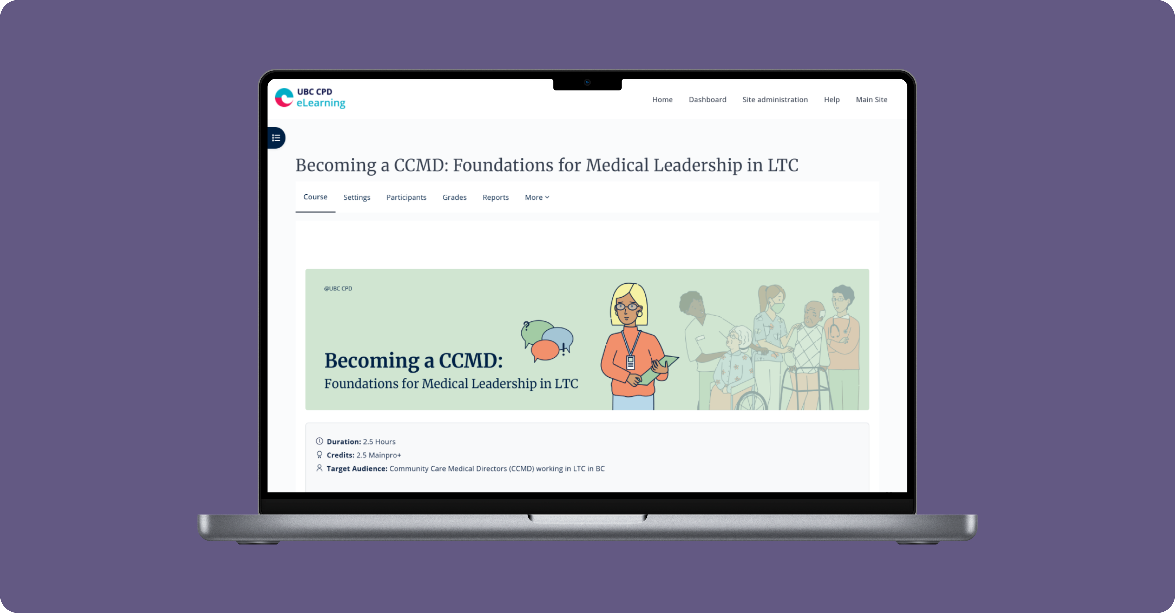
This project involved designing and implementing the eLearning course a Becoming CCMD as part of my work at Continuing Professional Development (UBC CPD) in collaboration with Fraser Health. The course is designed for Community Care Medical Directors (CCMDs), who serve as leaders responsible not only for clinical oversight, but also for collaboration, advocacy, and system navigation within the long-term care (LTC) sector. It emphasizes the role of strong medical leadership in fostering respectful, supportive care environments where LTC residents can thrive.
This was my first fully independent project, where I was responsible for end-to-end design and page implementation while working closely with the Learning & Curriculum Manager and Subject Matter Experts (SMEs).
Developing visual style and colour palette
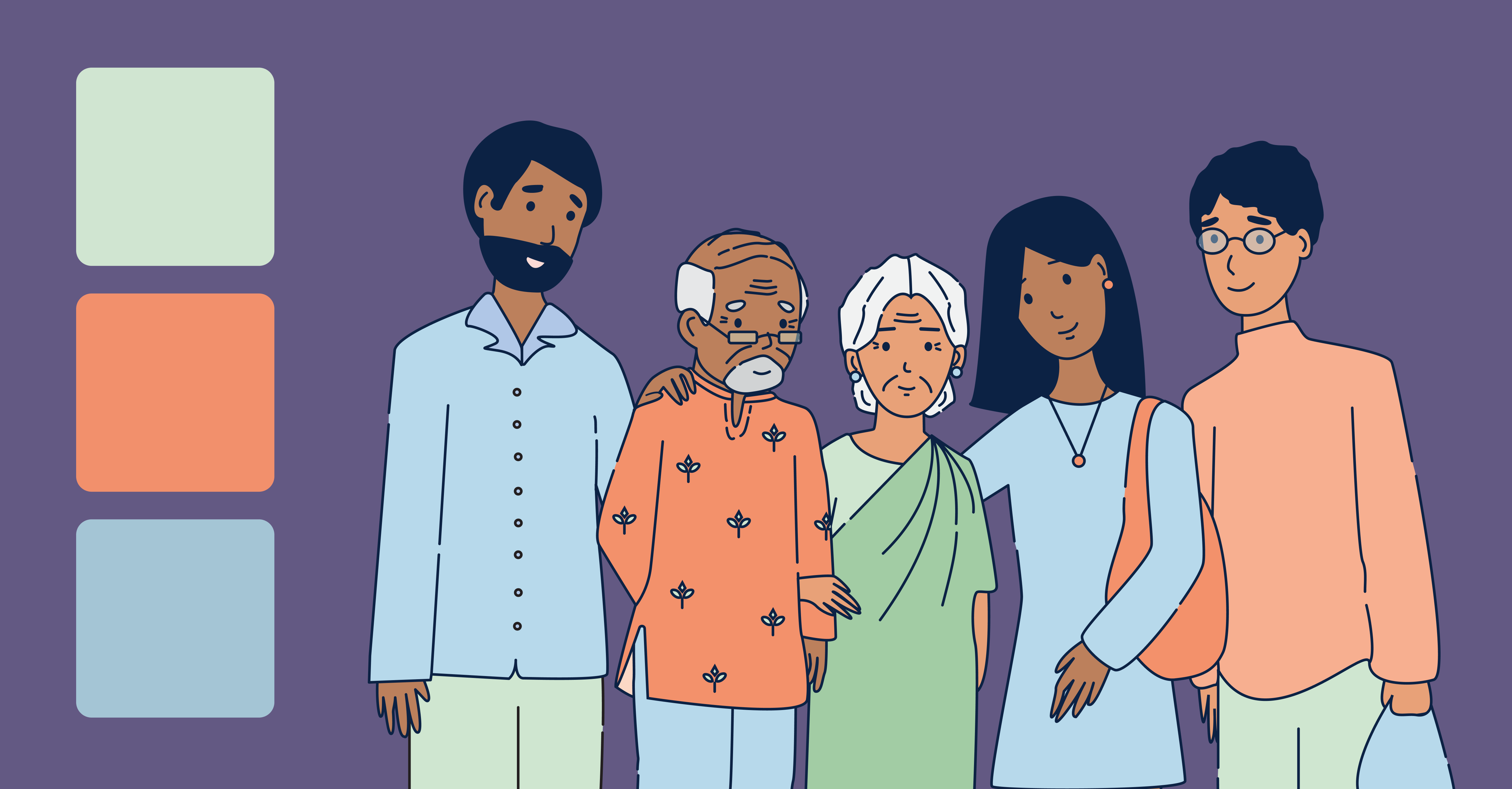
The first phase of the project focused on defining the course’s visual direction, including the illustration style and colour palette. The goal was to reflect the sensitive, human-centred nature of long-term care through a muted, calm palette, while still maintaining visual alignment with Fraser Health, whose brand identity includes blue and orange.
Following several discussions, we refined the palette to three core colours - orange, blue, and green - balancing warmth, trust, and care without overwhelming learners. The illustration style was developed as clean line art with soft colour fills.
Course design
My main responsibility as a designer was to work closely with existing course content and translate it into engaging, accessible learning experiences. Rather than presenting information as static text, the role requires re-structuring content through thoughtful layouts, visuals, and interactive elements that actively support learning outcomes.
Timeline
For example, one section of the course focused on the history of long-term care (LTC). Presenting this information as plain text would have been dense and difficult to process.
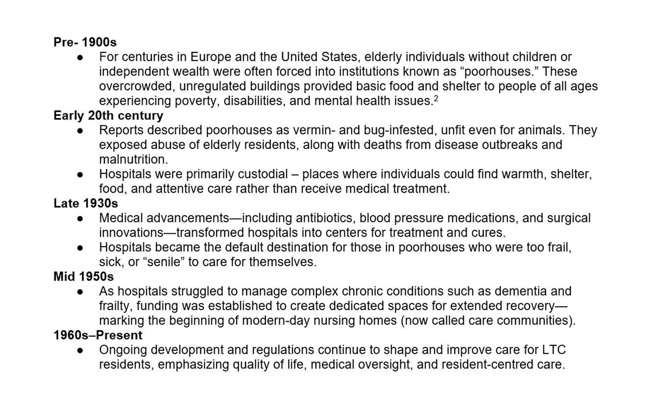
To address this, I designed an interactive timeline using the course’s established colour palette. Each historical period is visually distinct and selectable, allowing learners to reveal content one period at a time rather than all at once. This interaction supports progressive disclosure, reduces cognitive load, and helps learners more easily track change over time.
Flip Cards
For knowledge checks and conceptual clarification, I used flip cards to present formats such as myth vs. truth and true vs. false. These interactions encourage active engagement and self-assessment without interrupting the learning flow.
Infographics
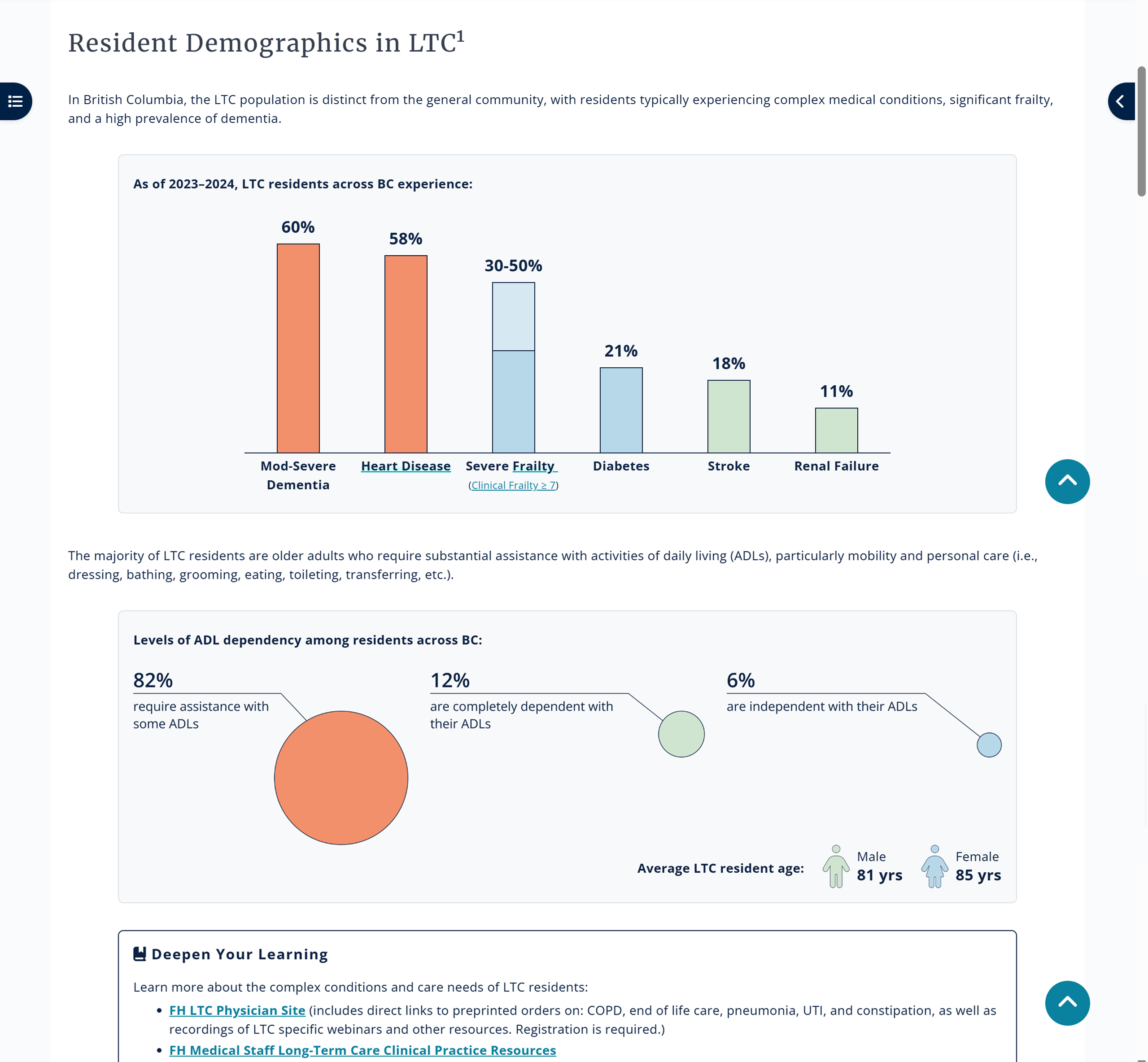
The course also required communicating complex data through visuals. To present statistical information, I designed and developed graphs and infographics. One page, in particular, required significant iteration to balance clarity, accuracy, and accessibility.
I referenced design precedents to determine appropriate graph structures for visualizing resident demographics by illness and levels of dependency among LTC residents.
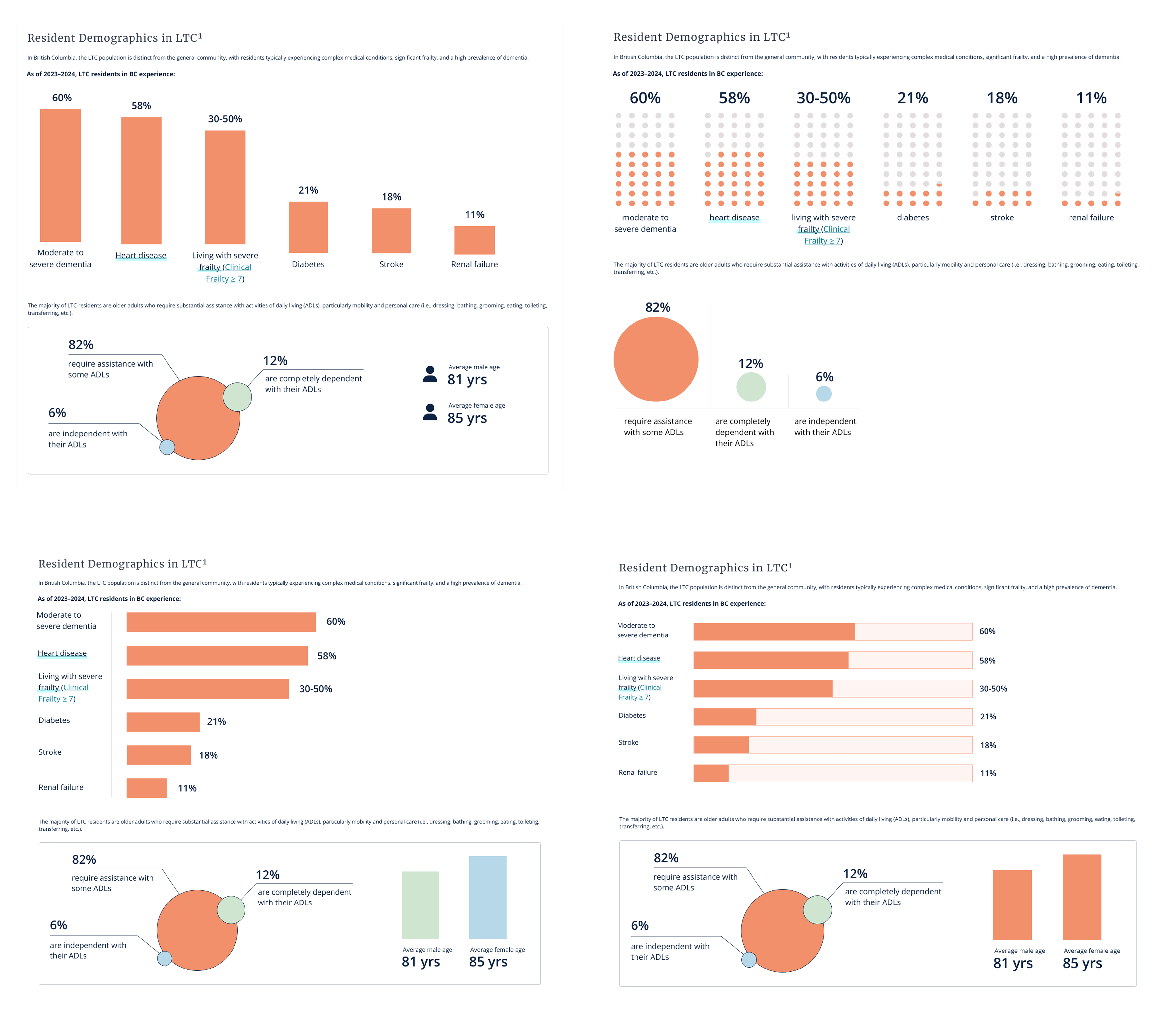
While multiple iterations and mockups were designed in Figma, the final version was implemented directly on the page using HTML, CSS and JavaScript. The final design uses the course's colour palette to visually separate data groups and improve scannability. Bar charts highlight the prevalence of key medical conditions, while circular graphics communicate levels of ADL dependency, allowing users to quickly grasp relative proportions and comparisons.
Accessibility
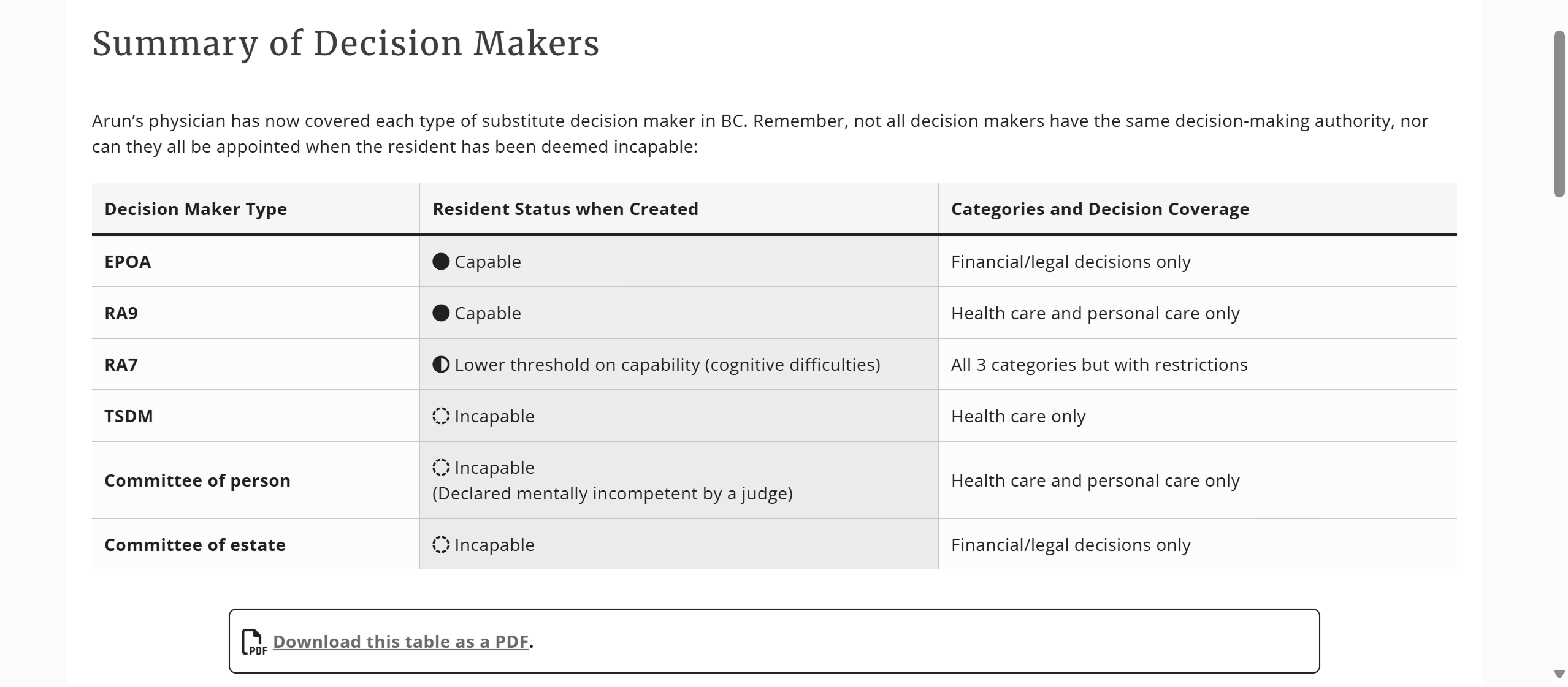
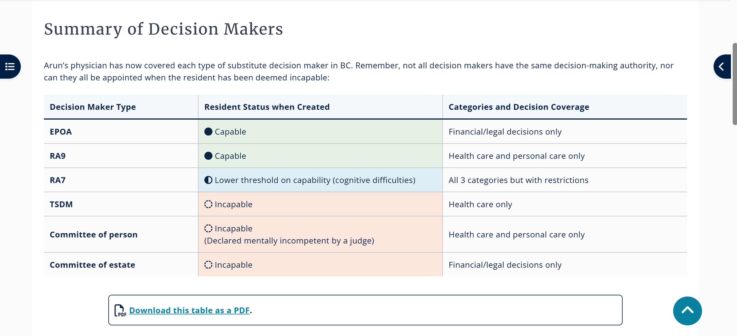
I designed this table to summarize complex legal distinctions between different types of substitute decision makers. An early goal was to visually differentiate capability status so learners could quickly scan and understand which roles apply under different conditions.
I initially explored using colour alone to indicate status (e.g., capable, lower threshold, incapable). However, when testing the design in grayscale, I found that all capability states look exactly the same, making them hard to differentiate and highlighting the limitations of relying on colour alone.
To address this, I iterated on the design by introducing iconography alongside colour, using distinct visual markers to reinforce each capability state. This dual-encoding approach (colour + icon) supports accessibility standards and reduces the risk of misinterpretation.
Reflection
As a final reflection, I truly enjoyed my time at UBC CPD. Contributing to projects that support healthcare and help medical professionals grow and expand their skills was deeply meaningful to me. This project also marked my first experience working independently as the sole designer on a project, allowing me to participate in external meetings and gain a deeper understanding of the eLearning course development process. I learned how much time, iteration and collaboration is required to produce high-quality educational materials.
This experience helped me grow not only as a designer, but also broadened my understanding of the healthcare system through working on projects related to substance use, breech birth, mental health and more. I was also fortunate to collaborate with an inspiring group of people who are deeply passionate about healthcare and creating meaningful impact.