Creating a responsive web presence for a bento cake shop
Overview
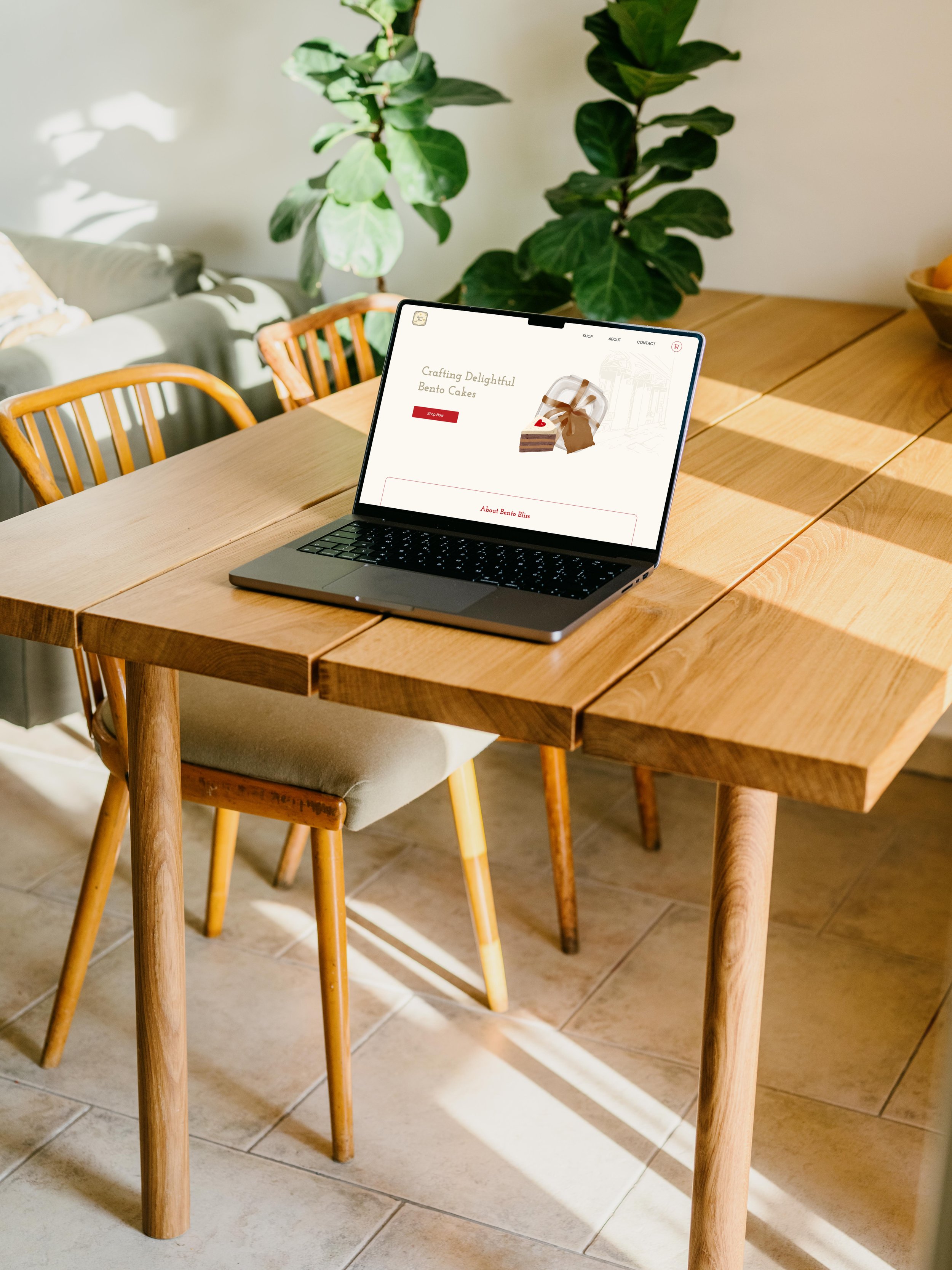
In this academic project, my teammate, Jae Eun Kim, and I collaborated to design and develop a website for Bento Bliss, a fictional company specializing in bento cakes for special small occasions.
Our primary objective was to create a company website that prioritized usability, maintained a consistent style, and offered relevant content appropriate for the company's products.
PROJECT TYPE
Web Design & Development
(Academic Project)
YEAR
Feb 2024 (4 weeks)
TEAM
Jae Eun Kim
MY ROLE
Visual Design
Development
Complete website walkthrough
1
During the initial phase of our project, we focused on conceptualizing a fictional company, and I made the decision to center it around a cake shop called Bento Bliss specializing in bento or lunchbox cakes tailored for smaller occasions.
The first step involved creating a style guide which includes the site’s interactive elements, text elements, and templates. This laid the groundwork for consistency and facilitated easier code maintenance.
Creating a company and developing a custom style guide

Credits to craft cake

The wireframes provided a clear visual guide to the page structure, layout, information architecture, user flow, and intended user behaviours. Additionally, they also aided in the identification of potential usability issues early in the design process, allowing for adjustments to be made swiftly and efficiently.
2
I created medium-fidelity wireframes serving as the foundational blueprint for the layout design
3
Developing a website with HTML and CSS
Next, we proceeded to the development stage, where my teammate and I split the tasks to ensure equal participation in building a website. I was specifically responsible for designing the homepage, shop page, about page, individual product pages, as well as the header and footer of Bento Bliss website. Throughout the process, we ensured smooth collaboration through GitKraken.
Initial design direction
Shop page
Contact Us page
4
Conducting usability testing
During class, I conducted usability testing with four participants showing our first website iteration. The participants narrated their exploration and impressions as they scrolled through our site, while I took note of their activities, assumptions, and questions. I particularly focused on the parts where they encountered difficulties, aiming to address any concerns they had during the process.
Feedback
Yellow colour might pose some accessibility issues, especially on a beige background."
"Submit buttons are not leading anywhere – they should be linked to the homepage, for example, or a thank-you page."
"Style guide is not attached in the footer."
"Sometimes it's hard to follow the flow and know where you are."
5
The testing provided valuable insights in terms of website usability and accessibility
Style guide update
First, we updated our style guide, where I changed the colour palette as well as some interactive and combined elements of the website.
Colour Palette section in the style guide
I finalized a new set of colours from our style guide to create a stronger contrast, ensuring sufficient differentiation between the background and foreground colours, featuring beige, red, and gold elements.
Adding new pages and updating the footer
Additionally, I decided to introduce new pages, particularly thank-you pages, to ensure a seamless user experience after subscribing to a newsletter or submitting a form.
We revamped our footer by adding more clickable elements and links, further enriching the browsing experience and providing users with convenient access to other pages.
Thank-You page after the form submission
Combined Elements section in the style guide
Introducing breadcrumbs to enhance user navigation
To enhance navigation and provide users with clues regarding their location on the site, we have implemented breadcrumbs. This navigation feature improves overall user experience by providing context to the website's hierarchy, allowing users to easily backtrack to previous pages.
Product page
6
Optimizing our site for different devices
Finally, we optimized our website for viewing across various devices, leveraging media queries and relative units to dynamically adapt the design to different screen sizes and ensure an optimal user experience across all platforms.

7
Learning takeways
This project helped enhance my skills in web design and development, particularly in building shop websites featuring product catalogues and checkout carts. I gained more insight into the significance of style guides for effective collaboration, elements consistency and easier code maintenance.
I also came to realize the crucial importance of conducting usability testing, especially in pinpointing areas where our site did not function as intended and in uncovering any challenges that the users encountered. If I were to do this project again, I would try to allocate more time on usability testing and refining design in terms of accessibility. This is important for ensuring that our design not only meets the needs of our end-users but also provides an inclusive experience.